Explore the background of mobile menu user experience (UX) both inside and outside healthcare, and understand trending usability research and how you can take your mobile menu to more usable heights.
The world isn’t accessing the web on desktops and laptops alone anymore. No, they’ve moved on to using voice assistants, tablets, and smartphones. People are browsing the web from city buses, hotel lobbies, or their living room couch.
Regardless of where these people are, they still need to be able to explore your website with ease, and mobile navigation is how they do it.
Mobile menu UX has been under a microscope for several years, especially as our mobile overtook desktop in 2016 as the primary way people access the web.
UX researcher Steven Hoober observed more than 1,300 people tapping away at their phones as part of a study, and found that in almost every case, we hold our phone three different ways:
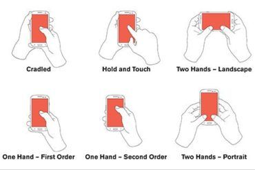
Interestingly, Hoober also found that people often switch between these three positions depending on their task or setting.
Our thumbs have become so integral to the use of our phones that medical researchers have proven a correlation between the use of our phones and developments in “thumb pathologies,” including pain or stiffness in some cases; in others, lower thumb strength because we’re not holding pencils and pens which require a firmer grip.
Understanding these observations and adaptations means we should create a smartphone experience that is ergonomic and comfortable for all users, regardless of how they hold their phone.
You’re probably most familiar with the “hamburger” navigation icon at the top of most webpages. It looks like this: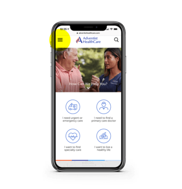
Hamburger icon
This icon typically holds the main, secondary, and any tertiary navigation. When clicked, it may drop down from the top of the screen or slide out from the side. No matter how it functions, it’s your blueprint to travel the site.
The usefulness of the standard mobile “hamburger” menu is hotly debated in UX communities around the world. Nielsen Norman Group – a leader in modern digital usability research – compares it to fast food chains : “It got designers addicted to its convenience, and now serves millions each day.”
In terms of advantages, hamburger menus are great for a large number of navigation items and a nice way to keep your design clean and free of clutter. However, because they’re “tucked away” in the corner, this menu can be easy to miss and can quickly turn into a junk drawer of links without proper governance.
Icon-only navigation
Icons have their purpose, but they can quickly move into bad UX territory when overused or not explicitly clear.
Icons work best when paired with copy. And, depending on your audience – including culture, language, and cognitive understanding – the icon image you use could represent many things, for better or worse. Nielsen Norman Group finds that universal icons are rare, but do exist, such as:
But less familiar across cultures are things like people icons (for online portals), or stars (for bookmarks or favorites).
Icons with copy can be helpful for task navigation, especially on mobile devices when they’re a “tappable” size for a finger or thumb. It’s best to test your icon approach with real users to see if they’re understood and helpful.
Visible navigation
Visible navigation has been gaining strength in recent years, especially as the hamburger menu alone doesn’t perform as well without a label.
So designers have taken it a step further, recommending a more visible navigation, almost in the form of tabs. In fact, tab navigation has been noted as the new hamburger navigation as early as 2018.
Anchoring visible navigation
This visible navigation can be used at the top of the screen, or the bottom of the screen. And anchoring these visible navigations have become a growing trend, too.
By anchoring navigation items, especially to the bottom of the screen where our thumbs are, you’re meeting users in an ergonomic sweet spot that makes these actions easy to reach.
Mobile menus on healthcare websites have primarily been relying on the standard hamburger menu that the UX world has seen for many years. And it makes sense. Healthcare websites are trying to reach a variety of people across different ages, genders, cultures, and web literacies. Creating a “hip” or “different” experience could alienate people if it’s not a proven and accepted norm of web UX.
But as relationships with mobile devices change and generations continue to adapt to new ways of finding information online, the way you implement accessibility of mobile menus and navigation should drive positive change for all patients.
If you haven’t analyzed your mobile menu in a while, a new assessment would be a good place to start. Some of the ways you can use an assessment to understand how your menu is performing include:
Once you implement a new mobile menu approach, keep a close eye on the analytics. Is traffic dropping off more than it did before? Are customers staying longer and exploring more pages? Is the search function increasing in use because things are harder to find, or is it decreasing because the navigation is easier to reach?
Understanding how your audience actually uses your website allows you to deliver a positive user experience.
If you’re looking for a partner to help you improve the user experience of your mobile menu, look no farther than Geonetric. Contact us today to get started with a mobile UX assessment.
The original version of this page was published at: https://www.geonetric.com/website-design/the-case-for-mobile-menu-ux/
At Geonetric, we create compelling digital experiences for healthcare organizations that make lasting patient connections and drive organizational growth. We solve your challenges with expert UX, ... Read more