CAUTION: Preference question at work.
The preference question has been around forever. Learn new ways to interpret it that provide better insight.
Quick Nav: Pros and Cons | Product Line | Conclusions | What's Next?View Original PDF
Community image studies have changed over the years with the advent of online technology as well as new analytical techniques. One thing that has not changed much over the years is the age-old preference question: “Overall, which hospital do you prefer most?” No matter how you word it, that question has seen a great deal of action in community image studies and is often the primary metric used to measure a brand’s strength. And according to a February 2007 survey by the Association of National Advertisers, among 297 of its members of the Brand Marketer Leadership Community, the metric cited most frequently as the “most effective measure of brand health” was preference.
But is that question the best metric for measuring a hospital brand’s health? There are pros and cons of that key brand-health metric and several ways to tune it up and perhaps replace it. The issues to outline and explore are (1) how wording influences preference, (2) why preference doesn’t always lead to utilization share, (3) why preference sometimes fluctuates when market conditions have not, (4) the value in splitting up overall preference into nonlifeand life-threatening preference, and (5) a glimpse into what the next generation of measuring brand health might be.
Overall preference is a simple question to ask respondents and has been asked for decades. On the surface it appears to give us an adequate summary brand-health metric regarding how one hospital stacks up against another. But many factors can influence its reliability and usefulness (some controllable and some not):
It’s all in how you word it. The overall preference question can be worded in many ways, such as the following:
Most people pick a hospital because they are directly asked to. But we don’t know the strength of or reasons for that preference. Often, people choose the hospital they prefer for more serious medical situations as their most preferred. And, as shown later, preference doesn’t always lead to utilization share. How we word that preference question can have a substantial effect on its interpretation and usefulness. Perhaps the following wording might give us a better connection to actual behavior: “If you could use only one hospital, which hospital would you most likely choose?” Then again, other things might still get in the way.
For example, in a recent study, two versions of preference for product lines were used: “Which hospital do you feel has the best reputation for (product line) regardless of whether you would personally go there for care?” and “Given all the reasons why you would choose a particular hospital, which hospital would you most likely go to for (product line)?” That survey also included a follow-up question for respondents who did not give the same response to both questions: “Earlier you said that (hospital) has the best reputation for (product line), but you also said that you would most likely go to (hospital) for that situation. Why would you not go to (hospital) for that medical situation?”
The results showed that there was a consistent drop between reputation and use. And reasons varied by market. That is, the farther people lived from a particular hospital, the more distance played a role in that gap. The closer people lived to a particular hospital, the more things such as insurance restrictions, physician not admitting there, or even scheduling hassles played a role in that gap. Furthermore, the “use” question wording correlated more strongly with recent utilization than did the “reputation” question wording. The point is, how you word the question (whether overall or by product line) will influence your findings. There needs to be a behavioral component to the construct. Even so, being the overall preference leader is not a guarantee of utilization leadership; life often gets between intentions and behavior.
Why preference doesn’t always lead to utilization share. Based on years of researching brands, I have identified three major components to brand equity: financial strength, brand strength, and market strength. A strong brand creates interest in itself for initial and repeat use (i.e., brand strength). And it also has to make sure it is “available” for those who want to use it (i.e., market strength). Lastly, strong brands are fiscally responsible (i.e., financial strength).
Strong brands must develop and commit to the financial resources to develop and maintain their brand and market strengths. Financial strength is not only an internal goal but also an external perception. How consumers perceive your financial health will affect your overall brand equity. Brand strength can be thought of as “pulling” the brand through the distribution channels; market strength can be thought of as “pushing” the brand through the distribution channels.
Pull: A strong brand creates interest in itself through its marketing, communication, and experience efforts that make people want to use it (again). Joel English, EVP at Milwaukee healthcare ad agency BVK, calls it “brand craving.” Essentially, with that strategy, consumers pull the brand through the distribution channel with their interest or satisfaction. That is accomplished by creating a strong brand position and experience (i.e., brand strength).
Push: Consumer attraction to a hospital can be undermined if the service or facility is not readily available or some other hurdle gets in the way of interest and actual behavior (i.e., a market barrier). For example, without a strong physician relationship, physicians can undermine a brand in which consumers are interested; not being in key insurer networks can cause people to go elsewhere; and having locations inconvenient to people also can cause them to go elsewhere (i.e., lack of market strength). That is a major reason why overall preference doesn’t always lead to utilization share.
When you’re developing a brand strategy, both push/pull elements must be addressed.
Although preference and utilization questions have been around for a long time, measuring the impact of market barriers has been underutilized. When preference does not lead to utilization share, it might simply be a matter of life interfering. The best intentions of any person can be mitigated when barriers emerge at the time of hospital choice. Your hospital can create strong brand demand among consumers. But when a patient goes to his physician and says, “Dr. Smith, I would like to go to Hospital A,” and Dr. Smith replies, “I think you would be better off at Hospital B because of ‘X,’” most often that patient says, “OK, you’re the doctor.” As the previous section (about reputation versus where people would actually go) showed, just because someone thinks your hospital has the best reputation or he even prefers it doesn’t mean he will actually use your hospital. Again, reality sets in and people make choices based on more than just prefere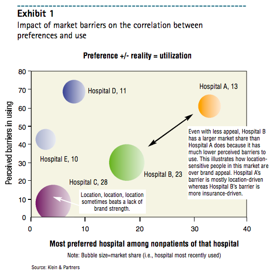 nce.
nce.
At Klein & Partners (a marketing research firm in Hinsdale, Ill.), we have developed a series of questions that address the impact market barriers can have on preference. For the hospital that is most preferred among nonpatients, we ask: “If you wanted to go to (hospital), are there any factors such as inconvenient location, health insurance restrictions, physician not admitting there, scheduling hassles, or anything else you can think of that could hinder you in using that hospital?” That is followed by: “What would you say is the single biggest barrier to using (hospital)?”
Exhibit 1 illustrates how those market barriers can have an impact on people’s preferences. For instance, in that exhibit, Hospital B has a much larger market share than Hospital A even though Hospital B’s overall preference among nonpatients is much lower. Notice that barriers to use for Hospital A are much larger—contributing to a lower share. Of course, lack of market barriers (i.e., market strength) can positively influence share even without much preference. Here, Hospital C has the largest utilization share in that market, yet its overall preference among nonpatients is the lowest of all competitors. Having almost no market barriers (e.g., it is the most conveniently located) creates market strength, which can overcome weaker brand strength. However, over time, competitors can combat market strength and overcome it. Successful brands create both market strength and brand strength.

Next, a statistical reason why preference doesn’t always lead to utilization: Preference is asked of all respondents, whereas utilization share is a subset of those with a recent experience. For example, suppose 60% of respondents in your survey had a recent experience and your hospital had a 30% share. That means 40% of people who were asked the preference question did not have a recent hospital experience. So the overall hospital preference of those 40% of respondents cannot be directly linked to your recent share of 30%. Whether your overall preference is higher or lower than 30% is spurious because you are not comparing apples to apples.
There are a couple things you can do:
Why overall preference fluctuates. Overall preference is strongly correlated to patient share. That is, for most hospitals, the majority of a hospital’s recent patients tend to pick it as their most preferred. Thus, the more recent patients you have in your survey sample, the higher your overall preference score will probably be.
What can we do about taking out that methodological fluctuation in overall preference so that real movement can be observed? There are three options for tuning up the preference metric: indexing to share, separating patients from nonpatients, and using a regression trend line. 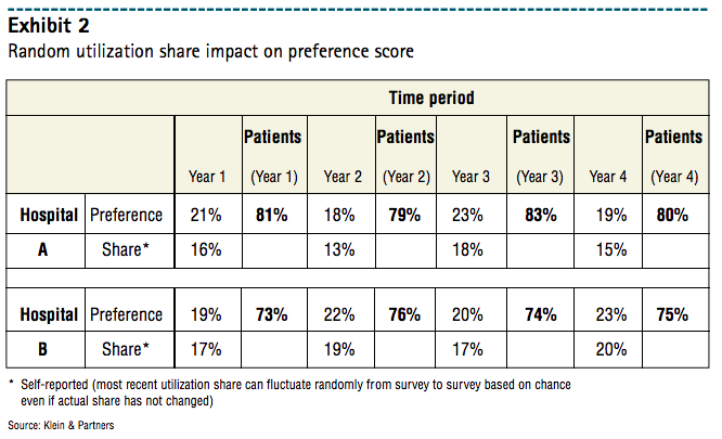
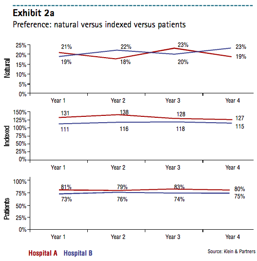
The table in Exhibit 2 presents overall preference data for two hospitals with data for four years (i.e., from four annual image trackers). In addition to the overall preference scores, recent utilization share figures reported by respondents in each survey are included. The first two solutions are illustrated in Exhibit 2a.
The first solution is indexing. One method of eliminating the impact that utilization share has on preference is to divide overall preference by utilization share to create an index. (For example, Hospital A’s preference in Year 1 is 21%. That divided by its Year-1 share of 16% yields an indexed preference of 131.) No matter what the utilization share is for that time period, its effects can be neutralized so Hospital A can be compared directly with Hospital B. However, the limitation with that method is that a calculated index is relative—not absolute. Therefore, an index of 131 doesn’t tell us whether that hospital is leading the market in an absolute sense. A small hospital with just a 5% share but a preference of 10% has an index of 200. So, when interpreting those indexes, look at the absolute scores as well.
The first trend line chart in Exhibit 2a is a typical presentation of the overall preference score over time. Hospitals A and B seem to trade off the leadership position every other year. Yet in the second line chart in Exhibit 2a, where the preference scores are indexed, Hospital A retains its leadership over the four-year period. The removal of share effects from the survey allows the researcher to see that Hospital A has a better preference score relative to its size than Hospital B does. However, hospital B could actually still have a larger market share, which that measure has just taken out of the equation.
 The second solution entails separating patients from nonpatients. When you look at patients and nonpatients across hospitals, any fluctuation in utilization share because of randomness is immaterial. That gives you a clear and comparable metric across hospitals. You can examine how your brand is doing among nonpatients compared with how your competitors are doing with their nonpatients and how you are doing with your own patients compared with how competitors are doing with their patients. Further breaking down the data to “no utilization” adds another dimension: What is my preference score among my recent patients, my competitors’ recent patients, and people with no hospital experience? That will help you better understand where future utilization might come from—repeat use, switching, or trial use.
The last line chart in Exhibit 2a shows preference scores by each hospital’s recent patient bases. Again, removing the effects of random utilization share in the survey each time period, the exhibit shows that Hospital A still enjoys a slight but consistent leadership position over Hospital B.
To drill down even further, Exhibit 2b shows overall preference for Hospitals A and B by their respective patients—as well as among their competitors’ patients and those with no recent experience. Market leaders—no matter the market size or competitive structure—tend to reach a threshold of at least 70% of their recent patients picking them as their overall most-preferred hospital. In our example, only Hospital A exceeds that threshold and is the leader against Hospital B. Plus, the detail of that chart shows us that Hospital A has much better growth potential than Hospital B among people who have not had a recent hospital visit. That growth potential for Hospital A is not as strong over Hospital B when we look at those with a recent visit to a competing hospital (i.e., not Hospital A or B). That is, efforts to gain trial appear more promising than efforts to entice switching.
The third solution is the use of a regression line. If you have several time periods of preference data, a regression line can be used to smooth out the peaks and valleys. The limitation with that solution: You need many data points for reliability (i.e., 5-6 or more points). Namely, any two points in time can produce misleading results and cause the marketer to overreact/underreact to the situation.
Splitting up overall preference into nonlife- and life-threatening preference. One of the limitations of that single metric: It can be difficult for a person to pick only one hospital as his most preferred. In other research we have conducted on people’s commitment to a single hospital, we find there is a great deal of “multicommitment.” That is, patients are committed to the hospital they used most recently but, depending on the situation, might use another hospital. That has nothing to do with satisfaction; it’s more an additional element of choice that many other industries also face (i.e., “it depends on my needs at the time”). For illustrative purposes, think of the pop market. Someone might really prefer Coke, but he doesn’t always feel like having a cola. Thus, he might drink a Mountain Dew or a 7 Up.
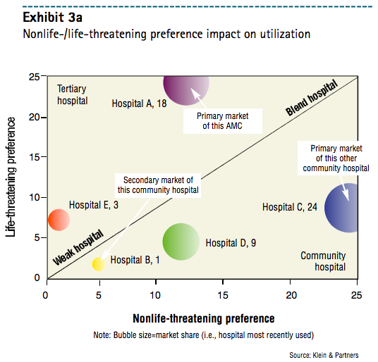
Asking consumers where they would prefer to go for a “routine or nonlife-threatening situation” and a “serious or life-threatening situation”—along with recent utilization share—provides for an interesting view of the market, as Exhibits 3a and 3b illustrate. Essentially, it carves up the market into four areas: tertiary hospitals, community hospitals, blend hospitals (i.e., hospitals with a strong reputation for being both high-tech and high-touch), and weak hospitals.
Where your hospital is placed on that bubble chart indicates your brand’s geographic reach potential as well as product line opportunities and challenges. More tertiary hospitals (i.e., upper-left area) tend to have a stronger geographic reach, as their high-tech reputations reach out farther than community hospitals. So when you produce a bubble chart across primary and secondary markets (for example), a tertiary hospital might not be the leader in either market—but its overall share will be strong in both markets (see Hospital A in Exhibits 3a and 3b).
In contrast, community hospitals (i.e., lower-right area) tend to have little geographic brand reach. That is, they are more likely to spend their days defending their own primary markets. People usually prefer them—often for location convenience—for nonlife-threatening situations to a much greater degree than for life-threatening situations. Thus, community hospitals’ utilization share is very strong in their own primary markets—but they have almost no reach outside their primary markets (see Hospital B in Exhibits 3a and 3b).
From a product line strategy standpoint, hospitals perceived as more tertiary or high-tech frequently struggle with creating preference for more routine or nonlife-threatening product lines. That’s because people are inclined to prefer more conveniently located (i.e., community) hospitals. Conversely, community hospitals often struggle with creating demand for their services when the situation is more serious (e.g., cancer issues, heart issues).
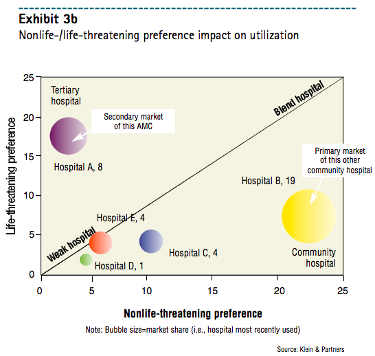
Hospitals along the upper part of the diagonal line have nearly equivalent nonlife- and life-threatening preferences. Those are “blend hospitals.” Hospitals along the “blend” line tend to have more geographic reach—coupled with stronger preference across more product lines. When image attributes are associated in the survey, those hospitals are inclined to score well on both the more clinical or high-tech image attributes and the more humanistic or high-touch image attributes.
Splitting overall preference into nonlife- and life-threatening preference adds a strategic layer of brand information and helps marketers better understand their brands’ opportunities and challenges in a competitive context.
Another question to consider is a follow-up to the overall preference question:
“Why do you prefer (hospital) the most? Would you say it is mainly because (read codes 1-7 and accept one mention):
Adding that question puts preference into context. Not all preference is created equally, and understanding the driving factor to a person’s preference gives a much clearer picture of your brand. Do people prefer your hospital because it is convenient (i.e., market strength)? Do they prefer your hospital because of its reputation or a good experience (i.e., brand strength)? Or perhaps insurance dictates your use (i.e., market strength or market barrier, depending on how you look at it).
Product Line and Overall Preference
Why is it that a hospital with a market-leading overall preference will also receive strong product line preference, even for services it does not offer (e.g., maternity)? It is because of a phenomenon called the halo effect. When a person really prefers a hospital overall, he tends to pick it for many of its product lines—with little thought. Remember, preference just means the consumer prefers you for something; it doesn’t matter whether or not you actually offer it.
The next time you conduct an image study with a product line preference section in addition to overall preference, consider:
adding in a product line or two that you don’t offer—to see what halo effect your brand has;
and, during data processing, creating a table of the average number of times your hospital is picked across the product lines examined in the survey—and looking at those means by whether your hospital is preferred overall (as well as which product lines were picked)
Most likely, those who prefer your hospital overall will pick your hospital for many more product lines on average than will people who don’t prefer your hospital overall. You can also observe the mean number of product line preferences by those who prefer you for nonlife- and/or life-threatening preferences — for additional insight into your product line strengths and weaknesses. Finding out where you have a halo effect in your pro ductline portfolio can help you fine-tune marketing efforts and develop and/or maintain product line management strategies.
The overall preference question can be a metric that provides useful information. Clearly, there are several ways to improve that metric to offer more reliable and helpful information. To reiterate, something as simple as wording can substantially affect the outcome; the timing of your survey can influence your scores based on controllable and uncontrollable factors such as seasonality, halo effects, and publicity; random fluctuations in utilization share can create peaks and valleys in your preference share that aren’t really there; life sometimes gets in the way of good intentions; and breaking up overall preference into nonlife- and life-threatening preference can provide a whole new understanding of the brand landscape. Even though preference has been around a long time, as marketers and researchers we need to ask ourselves whether those improvements to measuring and reporting overall preference are enough—or whether we should explore an entirely new way to measure brand health.
The future might hold even more powerful metrics of brand health. One such metric to consider is based on the theory of commitment explored by Jan Hofmeyr, developer of the Conversion Model and co-author of Commitment-Led Marketing (Wiley, 2001). In measuring commitment, it is critical to understand that loyalty and commitment are two different constructs. As Hofmeyr states, “Loyalty is behavioral (i.e., what you buy) while commitment is emotional (i.e., how you feel about what you buy).”
A person can be behaviorally loyal to his hospital—using it over and over—but not emotionally committed to it (e.g., the hospital is most convenient). Those patients are vulnerable to switching because the hospital experience might falter, they just don’t care that much to which hospital they go, another hospital might come along with a better offer, or no single hospital totally satisfies their need state. Gaining emotional commitment from patients can lock in behavioral loyalty unless market factors heavily come into play or patients remain multi-brand committed. “From a marketing perspective, loyalty can be bought while commitment can not,” Hofmeyr states.
Based on the work of those in the field of commitment, I have developed a series of questions that measure both emotional attachment on the part of recent patients and emotional attraction on the part of hospital nonpatients. Each of those metrics comprises four segments that vary in the respondent’s degree of attachment or attraction to various hospitals.
Attachment can be measured by four questions:
importance of the hospital choice
satisfaction with the experience
whether the hospital is everything the respondent looks for in a hospital (i.e., needs fit)
whether other hospitals appeal to the respondent
Essentially, attraction is measured by asking questions regarding what hospitals—which respondents haven’t used— appeal to them.
Successful brands attract and retain customers more effectively than their competitors do. Using those commitment measurement questions provides a more robust metric of your brand’s health, answering two questions: What is our potential for new growth (attraction) and what is our potential for retention and organic growth (attachment)? When you couple those brand strength metrics with the market barrier (i.e., market strength) metrics and financial strength metrics, you get a complete picture of your brand equity. MHS
About the Author
Rob Klein is principal of Klein & Partners, a healthcare marketing research firm in Hinsdale, Ill., and may be reached at rob@kleinandpartners.com.
The original version of this page was published at: http://www.kleinandpartners.com/Documents/improving_the_preference_question.pdf
Rob Klein founded Klein & Partners with the purpose of helping healthcare clients find their brand voice through innovative market research services. Since inception, the company has grown ten-fold... Read more